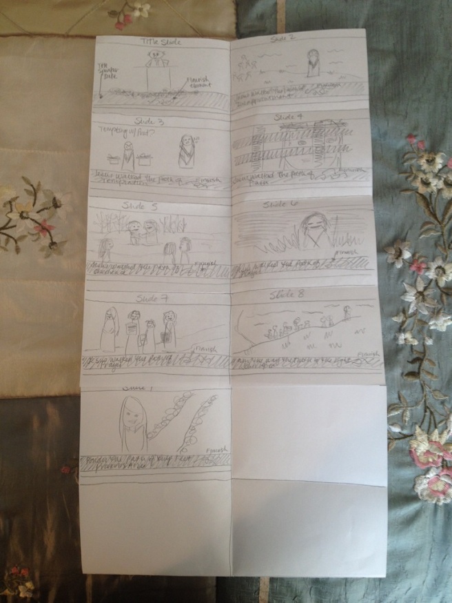
The talk I chose to base my project on is one that was given by President Thomas S. Monson in the Sunday morning session of General Conference in October 2014. Of all the talks he has given over the years, this one is my favorite. I begin by reading the talk and creating a brief, almost bullet-point style outline. From there I tried to winnow the point of each thought down to a single word that I could have stand out in each of the slides.

I knew I wanted to use the Church’s recent Bible video images as I thought they might be more powerful than trying to use artwork. I began by sketching out some very simple images in a storybook format so I could get an overall feel for the design I was trying to create.

Once I gathered all the images and design elements I wanted to use I began to play with a color-scheme. Originally I went with a very neutral brown-tan for the borders and banners around my slides and white text. It was a nice scheme that really helped the photos stand out, but it didn’t do anything for the message that I was trying to share through the text. So I changed to a navy blue and a tan with more of an orange base–going for a complimentary color-scheme. I also started out with an Oldstyle font and then after reading the instructions again I changed to a sans serif font style.
After posting my project for review I got some helpful suggestions from Dianne Caton and Chearsten Webb who made some suggestions on my text banners and also on the slide arrangement. I also asked Brother Shurtliff for his feedback, particularly regarding the fonts. My message is clearly about the Savior and my audience would be fellow church members, so I was really drawn toward an Oldstyle font as it looked a little “older” and more elegant than a modern looking sans serif font. Brother Shurtliff suggested combining the two and suggested Georgia as a oldstyle font choice. After playing around with several different Oldstyle fonts, I agreed that Georgia looked the best. I am very pleased with the final draft!
Message: The Life of Christ, Christ is our Example
Audience: LDS Church Members
Fonts: Monserrat (Sans Serif), Georgia (Oldstyle)
Color-Scheme: Complimentary (Orange and Blue)
Links:
Talk: http://www.lds.org/general-conference/2014/10/ponder-the-path-of-thy-feet?lang=eng
Images: 1. http://www.lds.org/media-library/images/april-2014-general-conference-1242127?lang=eng
2. http://www.lds.org/media-library/images/jesus-christ-teaching-sermon-mount-958537?lang=eng
3. http://www.lds.org/media-library/images/jesus-mary-martha-1617344?lang=eng
4. http://www.lds.org/media-library/images/jesus-light-of-the-world-948885?lang=eng
5. http://www.lds.org/media-library/images/jesus-christ-crown-thorns-827201?lang=eng
6. http://www.lds.org/media-library/images/john-baptizes-jesus-958635?lang=eng
7. http://www.lds.org/media-library/images/jesus-woman-taken-in-adultery-948852?lang=eng
8. http://www.lds.org/media-library/images/miracles-of-jesus-feeding-5000-1433376?lang=eng
9. http://www.lds.org/media-library/images/pictures-of-jesus-1128833?lang=eng
10. http://static1.squarespace.com/static/4ff3a56484aecc34311d5519/t/52d8c75ce4b08b61cb1b539d/1389938524505/Flourish+A_white.png

Sierra, great slide presentation! I liked your draft, but your final is even better. You rearranged your slides to make your story flow better. You also found a different image to portray the pain Christ went through and the service he gave. The images made me ponder what path my feet are taking. I also thought your recurring shape throughout the slide design added a touch of elegance. Check out Tammy’s blog at https://tnicholscomm125.wordpress.com/category/design/
LikeLike
I really like the unity of your piece. The graphic elements you used were consistent, as well as the fonts, and I think that worked well. Your images went well together, and they seemed to work well as a color scheme as well. Feel free to check out my blog here. https://isaacald.wordpress.com/2016/02/11/week-6-slideshow-presentation/
LikeLike